Eaton Socon Pre-School
by Devlin Architects
Client Eaton Socon Pre-School CIO
Awards RIBA East Award 2019, RIBA East Project Architect of the Year 2019 for Simon Devlin - sponsored by Taylor Maxwell
In architectural terms, this was very much a one person show and demonstrated the demands placed on a sole trader at the start of their career in architectural practice. The concept designer, technical architect, project manager, planning advisor and telephone receptionist were all the same person.
A community pre-school project, surviving their inadequate and decrepit mobile classrooms, the architect was initially drawn in when his child was enrolled. Initial help developed and grew, throughout an epic journey that saw funding come and go, planning get mired and the chilling discovery on site of a redundant MoD refuelling pipe, to pick out just a few highlights from the project narrative.
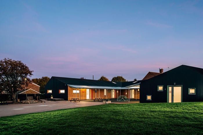
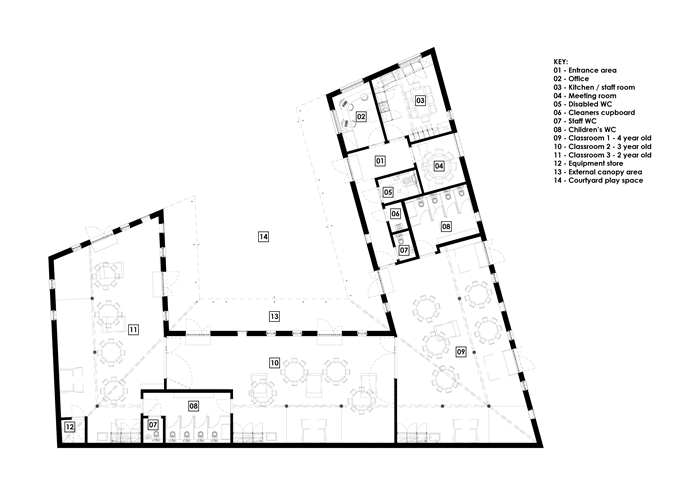
Entrance is via a frontal courtyard, perfect for parents bringing their children for drop-off. Receiving staff can be easily seen and the children immediately engage with the large open play space filled with their friends. Entrance to the building for visitors is by the office on the end of one of the arms of a ‘U’ shaped plan. This is perfect planning, as the visitor is immediately welcomed by the school secretary in a strategic location that has two horizontal panoramic windows. The visitor can be tracked up to the entrance, and all the activities in the play courtyard remain under gentle, but constant surveillance.
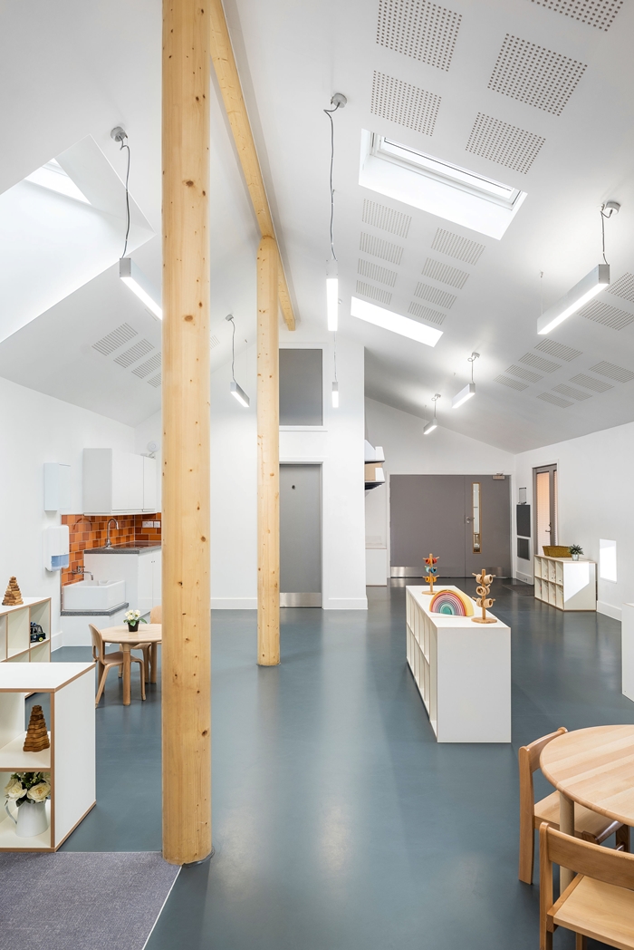
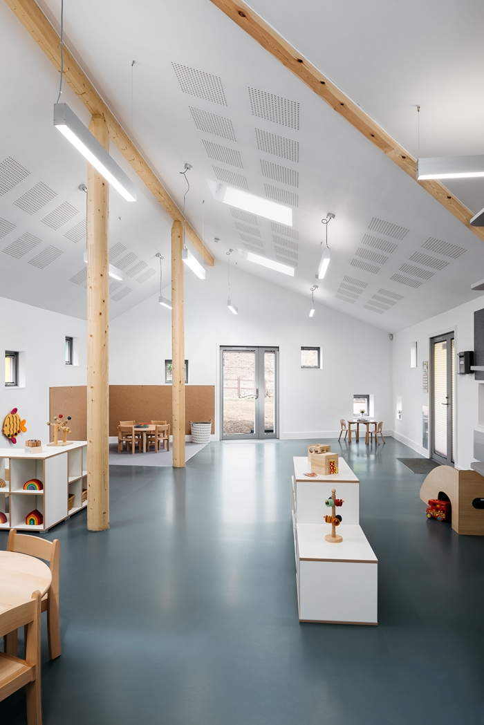
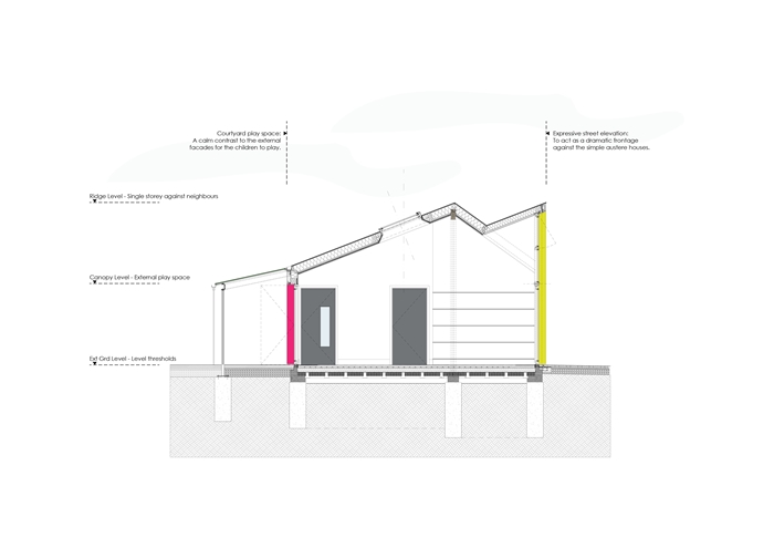
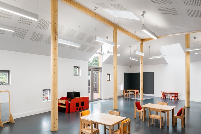
A ‘U’ shaped plan works very nicely, with each arm of the ‘U’ forming a large classroom, all three of which can be opened into one flowing space. Stores, toilets and wet areas are tucked discreetly into the corners, allowing the three teaching spaces to dominate. A row of central glulam columns aligned with the ridge of the pitched roof, rather than interfering with the large open classrooms provide a nice architectural division, so more intimate reading, doing-and-playing sub-spaces can be created with furniture and cushions. Although lofty, the classrooms have achieved a child’s scale.
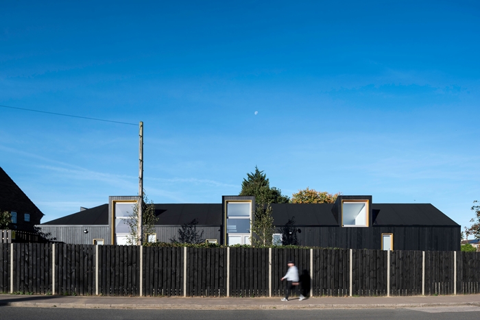
From the outside the building disguises the range of very cost effective materials that had to be used in a dark-grey-to-black unifying cloak. Routed slots have been cut in the darkened timber cladding, avoiding the clutter of screwed-on metal plates and other fittings. Despite the budget palette of materials, the result is a unified look and feel, which is brought to life with sparing use of bright colours in the window reveals. At a distance these bright colours look like a powder coated metal, they are so striking in the dark visual field; but in fact the effect has been achieved with a translucent stain. Again, the architect has managed to get maximum effect from very ordinary materials.
So often architects put their heart and soul into a project and get little thanks for it. Here the client is delighted with all they have gained from the brilliant management of a very low budget. Recognition is due for the dedicated and sophisticated design thinking that has made so much from so little.
Contractor Mixbrow Construction
Structural Engineer Constant Structural Design
Quantity Surveryor / Cost Consultant Gill Associates
Landscape Architect Robert Barker Garden and Landscape Design
Internal area 315 m²
