Royal Papworth Hospital
by HOK International
Client Royal Papworth Hospital NHS Foundation Trust
Awards RIBA East Award 2021
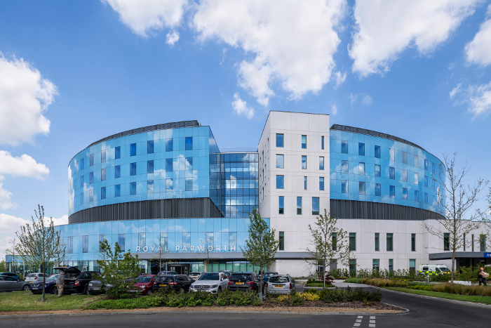
If a hospital is a machine for healing people, it appears all too often that hospitals seem to prioritise functional requirements of treating the body, rather than the mind and soul, in the design of their physical environments. With notable recent exceptions such as Maggie’s Centres, the design of many hospitals is often reminiscent of a spreadsheet in physical form, making them a depressing experience to work in or visit, even when in good health. Thankfully at the Royal Papworth, that is demonstrably not the case.
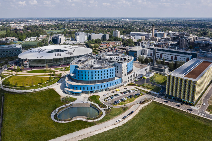
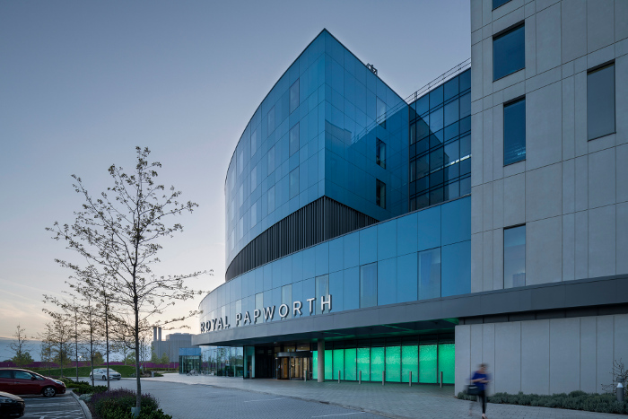
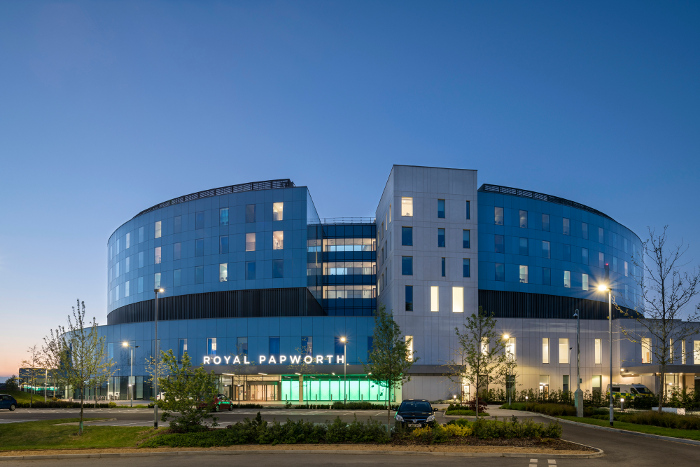
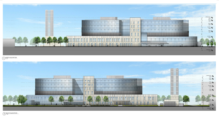
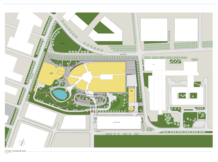
The circular form of the upper storeys of patient rooms, wrapped in light blue glazing, sits above a substantial plinth of light-coloured concrete which contains intensive care on the first floor and meeting and administrative accommodation below. The curved form of the ‘doughnut’ plan is an unusual and distinctive presence within the Addenbrookes campus. It is a surprising form that prompted the question ‘how and why is that a good form for a hospital?’ The answer lies in the layout inside.
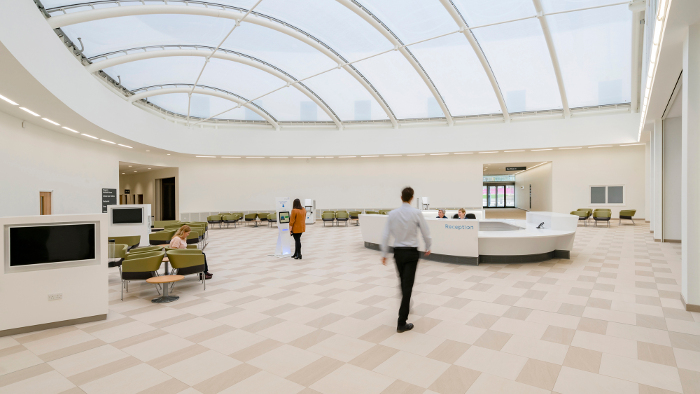
The clear organisation of the building is immediately evident. The use of natural daylight to draw you into the central circular courtyard gives an instant sense of peace and clear orientation. The ambience is one of calm efficiency, just as you would hope a hospital dedicated to dealing with heart and lung ailments should be. The central reception makes it easy to orientate yourself within the hospital and seeing the inside of the doughnut from below provides a visual connection between entry sequence and subsequent movement around the building.
Each patient has their own room, which is a segment, either on the inner or the outer ring. The geometry helps to make each room, though identical, feel specific and individual. The glazed folding walls to the internal corridor allow both a visual connection between patient and staff (with privacy through curtains) and ease of access for beds to be taken in and out for treatment.
The central corridor that contains the staff facilities serves both sides simultaneously, yet the internal glazed walls mean that you can see from the inside of the doughnut to the outside and vice versa, and see daylight at both sides. This visual connection improves the experience both for patients and staff. The corridor at the centre of the plan always curves away from you so that you don’t get a long corridor disappearing into the distance; it inherently limits its visual length. Within ICU, even the side walls between the rooms are glazed, which gives a flexibility between visual transparency and privacy, useful at different times, for both staff and patients.
The Royal Papworth Hospital is an example of how a building type, where functional requirements necessarily drive the design, can be elevated through good design to a building that lifts the spirits.
Contractor Skanska
Quantity Surveyor / Cost Consultant Skanska
Structural Engineer Skanska Technology
Environmental / M&E Engineer Troup Bywaters & Anders
Fire Consultant Fire Ingenuity
Planning Consultant GL Hearn
Soft Landscaping Consultant FIRA
Acoustic Engineer SRL
Project Management Skanska
CDM Coordinator Capita
Approved Building Inspector HCD Bureau Veritas
Internal area 43,500 m²
