Thames Tower
by dn-a architects
Client Landid Property & Brockton Capital
Awards RIBA South Award 2018 and RIBA Sustainability Award 2018 - sponsored by Geberit
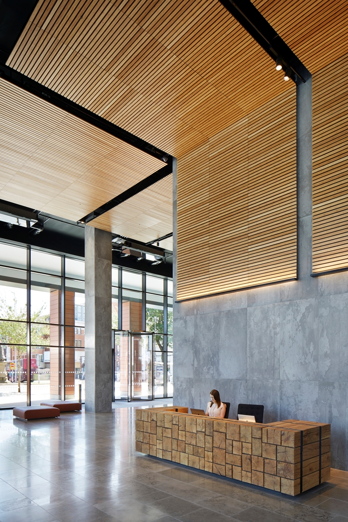
Thames Tower is so much more than just another smart office building. It distinguishes itself through the creative re-use of the skeleton of its predecessor, the huge contribution it makes to the public realm, and the refined purity of its architecture.
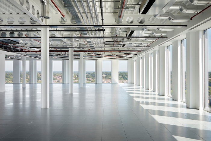
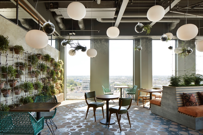
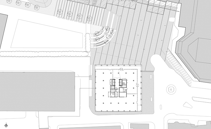
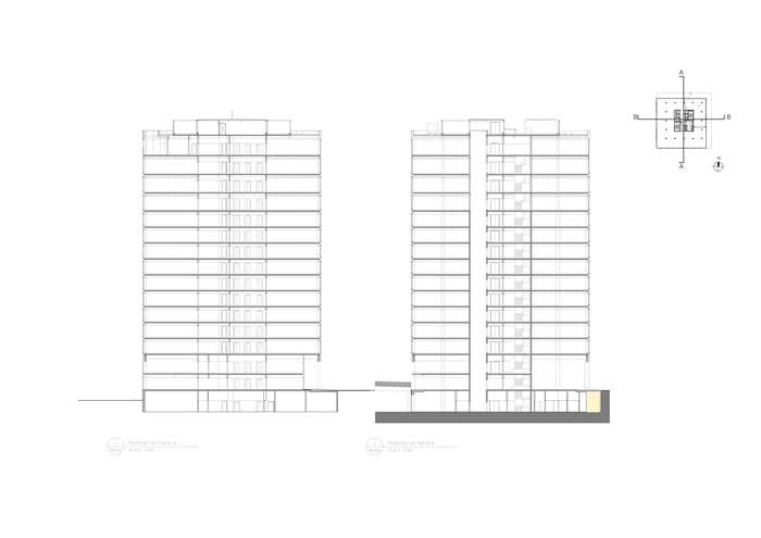
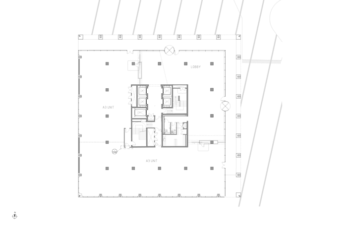
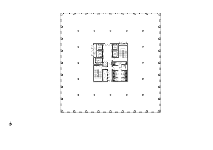
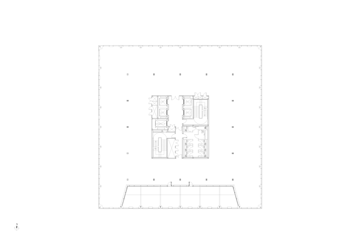
The site is bang in the middle of Reading, directly addressing the new railway station across a paved plaza. Thousands upon thousands of townsfolk, commuters and visitors cross this space every day. The building that sat here before Thames Tower was a stumpy and outdated 1970s office in dire need of repair; hardly fitting for such a prominent location. But the development team chose not to completely demolish it. Instead they stripped it back to its concrete frame and through creative engineering succeeded in adding a further four floors to it, at the same time as completely re-imagining the interior and exterior. This is a model of creative sustainability; all the embodied energy in the concrete has been preserved, and yet the resultant building is so pristine in form and the interior spaces so light and open that it is hard to believe it is not completely new, let alone a re-working of the previous eyesore.
The effect on the surrounding area is remarkable. Reading’s major urban space is now graced by a building of modern majesty. It is simply a commercial office which offers to the town a gracious colonnade and a new coffee shop and restaurant at ground level, but its impact on the public realm is more far-reaching than that: the building’s calm aura of assured quality upgrades the space - and the town.
This is down to the architecture. Reading has its fair share of office buildings of gratuitous gloopiness, fussy facadism, and random roofscapes. This building avoids all those traps: it is a model of restraint and refinement. The form is a simple cuboid, imbued with gravitas by the weighty terracotta cladding. The windows start tall and then get taller towards the top. The facades are smooth and unfussy and carefully composed in detail and proportion. The whole thing is an object lesson in the virtue of studied simplicity.
Contractor Bowmer & Kirkland Ltd
Structural Engineer Peter Brett Associates
M&E Engineer Ramboll UK Ltd
Project Management Rider Levett Bucknall
Landscape Architects Turkington Martin
Interior Design dn-a architecture and MOHO London
Lighting Design Light Bureau
Internal Area 23470 m²
