Mailbox
by Stanton Williams
Client Brockton Capital & Milligan Retail
Award RIBA West Midlands Award 2018
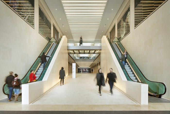
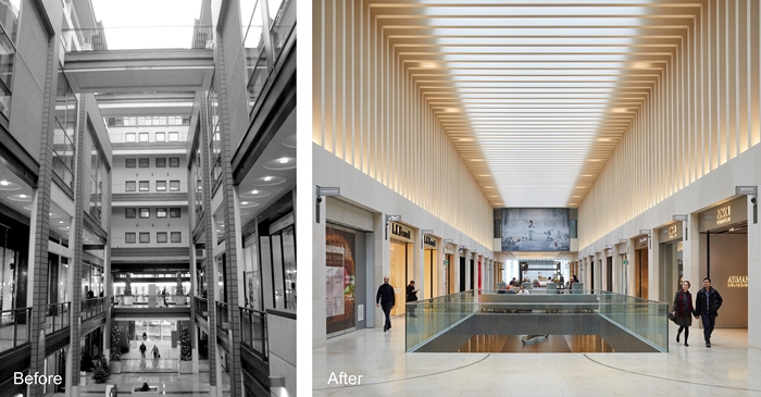
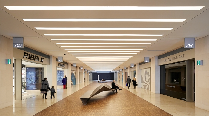
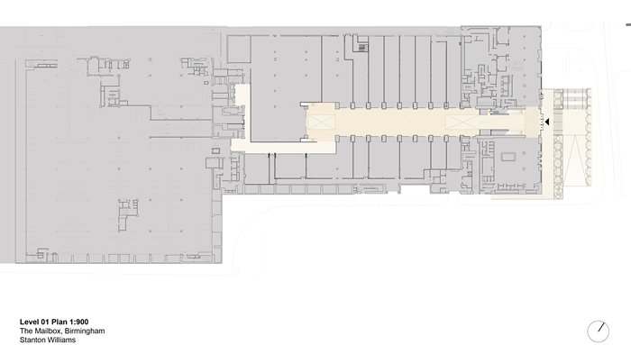
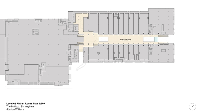
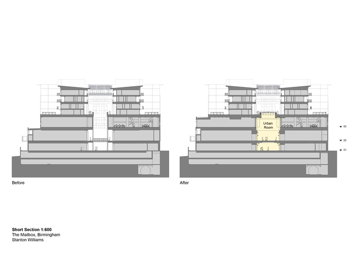
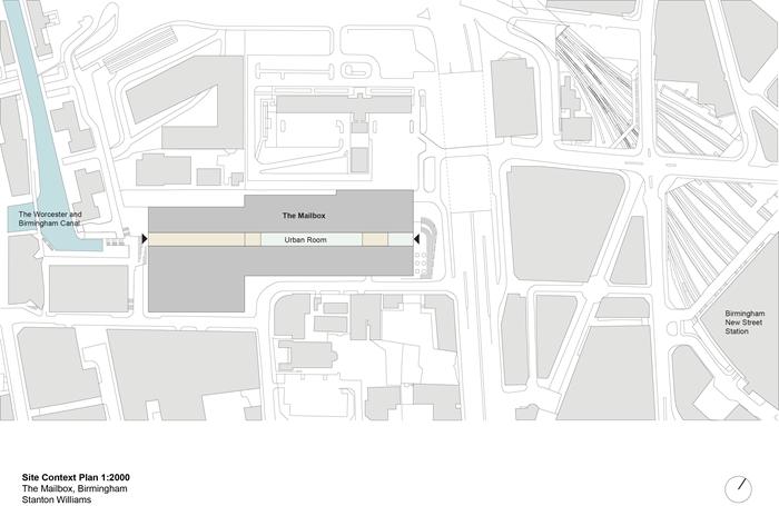
One of the most successful aspects of the original conversion of the Mailbox from postal office to a mixed use building with offices and apartments above a retail and parking podium was the opening up of a new pedestrian route through the building. From a retail point of view, however, it performed less well than expected, a fact attributed largely to its being open to the elements. The brief to the architects from client Brockton Capital LLP and Miligan Retail Ltd was to breathe new life into the multi-level mall by enclosing it. Destined for high-end shops, the client stipulated that the space should feel more like an ‘urban room’, a place of pause rather than passage.
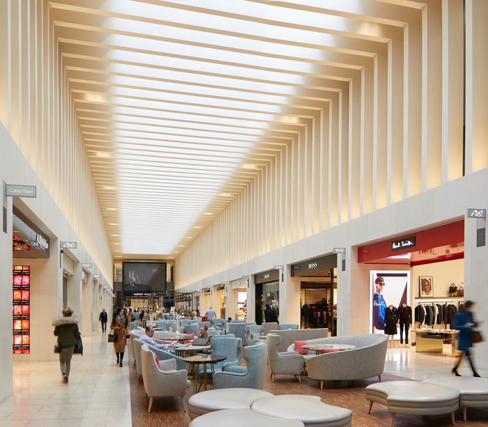
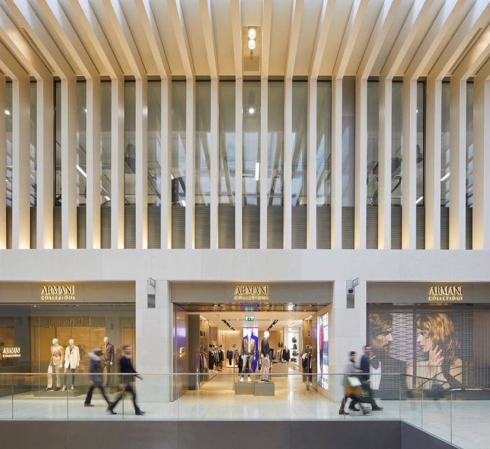
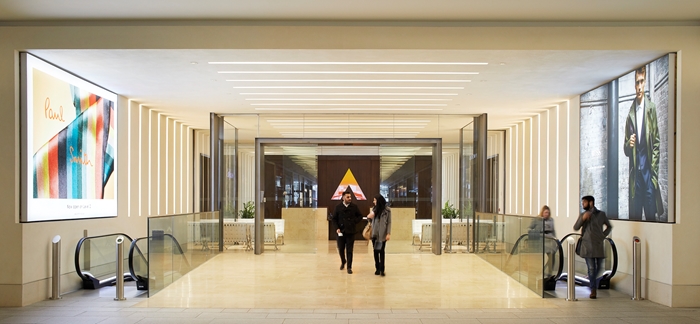
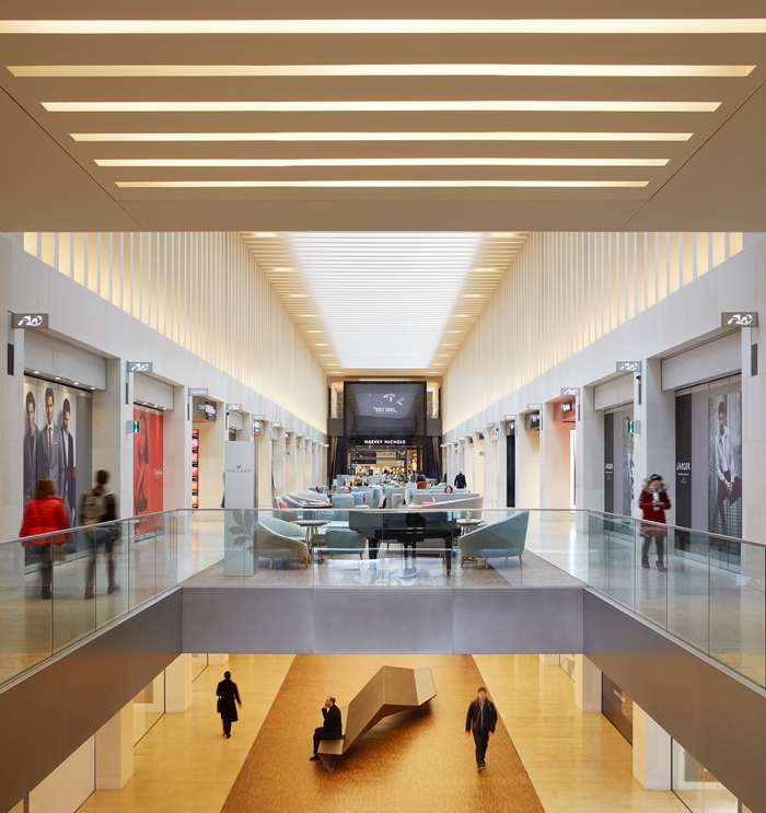
The result is a high-quality arcade with the kind of atmosphere normally associated with an art gallery. Its elegance and pervasive sense of calm luxury derives from a ‘less is more’ approach to the concept. Eschewing the more usual free-for-all of different shop fronts, creating what often comes across as a rather forced indoor recreation of the high street, the architects have imposed a unifying aesthetic that draws together walls, floors and roof within a consistent palette of creamy white stone, plaster, glass and metal. To the usual clutter of competing signs and branded shop fronts the architects have brought a serene order which extends to the design of bespoke fittings integrating signage, lighting, alarms and security cameras.
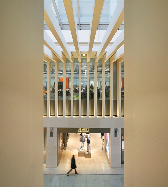
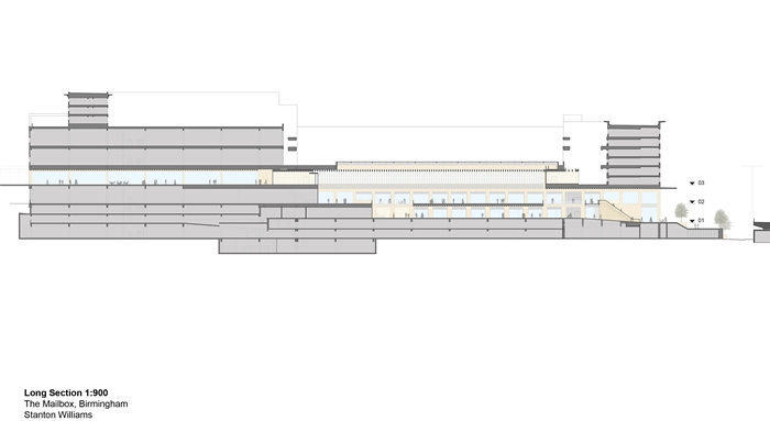
Rather than adopting what would typically be the default strategy of full-width skylights, daylight and views are filtered through a series of closely spaced white baffles that return down the walls on either side of the space, reinforcing the feeling of arcade and increasing its perceived perspective depth.
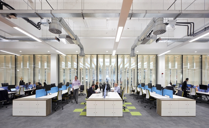
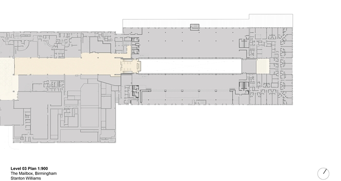
The design commission was extended to include the refurbishment of the existing offices above the shops on either side of the arcade, thereby ensuring that views and light for the workers were taken into consideration. The original punched-hole windows on this side were replaced with full-height, full-width glazing, which even with the added layer of baffles provides good levels of daylight and angled views.
The architect’s fulfilment of the client’s brief in such a convincing manner is all the more remarkable when one considers that the project was implemented within an occupied building with severe restrictions on aspects of its design and construction. The cohesive quality and rigour of the finished spaces shows no evidence of the compromises one might have expected, giving the project a distinctive poise that undoubtedly owes its success to the architects’ unstinting dedication to their craft.
Architect Stanton Williams
Client Brockton Capital & Milligan Retail
Contractor Galliford Try
Structural Engineers Curtins Consulting Engineers
Environmental / M&E EngineersClancy Consulting Ltd (Birmingham)
Quantity Surveyor / Cost ConsultantGleeds (Birmingham)
Lighting DesignSpeirs & Major
