Business branding is not something that is taught on architecture courses. Yet designing a building and building a brand have much in common. In an increasingly joined-up world, many energetic practices are finding new ways to diversify their business, and branding is one of them.
"The stages you step through in branding are quite similar to those of architecture," states Laura Sanjuan, Director and founder of practice SODA Studio. "They seem to work really well together."
"Branding is now a service we’re applying on most of our new projects. It opens our client base up more. It’s a vital part of our commercial work especially."
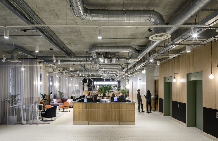
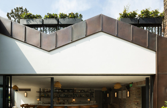
SODA now has a team of 17 people that includes several graphic designers. It has an enviably broad range of projects that includes office spaces, restaurants, theatres, nightclubs, and the public realm - as well as residential flats and one-off houses.
However, Sanjuan began the practice some ten years ago as a one woman outfit working from a kitchen table, later joined by fellow Director Russell Potter. Diversifying into branding happened organically, stemming from the practice’s recognition that it needed to rebrand itself as a business.
"Our main focus was to deliver on projects; we were very heads-down. But we started to become very aware of how we were perceived by the public and potential new clients," Sanjuan explains.

"We considered going to an agency, but we thought getting someone to do it in-house would be a much more interesting, soul-searching exercise."
Their rebrand, by Katie Stamp, was wholly comprehensive, right down to meeting minutes, proposal documents, and how the practice communicates. This eye-opening experience inspired the practice to offer a similar service within architecture: working branding into building design and providing a fully integrated business identity.
SODA decided to bring Stamp’s expertise on board permanently: she is now their Head of Graphic Design.
"A building is a brand as well," Stamp affirms. "Although branding and architecture are different disciplines, you apply the same kind of thinking and strategy. We are asking questions such as 'How are people going to use this space?' and 'What is the user experience?'"
Devising brand values with the client at an early stage, rather than implementing them after a building is complete, brings about impressively coherent results. They have led to repeat clients and word-of-mouth new work for SODA.
In the case of the Boulevard Theatre in London’s Soho, setting up brand strategy workshops as early as possible immediately engaged the client’s focus, both tightening the long term vision and expanding the brief.
Early stage immersive workshops went on to inform everything from the name of the theatre, the building design, the fit-out, the signage, and the period-specific furniture, to bar menus, the website and digital presence: the ‘full 360 degrees’ as Stamp puts it.
SODA even helped design staff uniforms, an activity the practice later returned to via their contribution to a charity T-shirt series for the Sanctuary Campaign. "It was great to be able to wear something we’d designed," enthuses Stamp. "We’ve had requests to make another run."

Having the in-house capacity to offer integrated design solutions can clearly take a practice in profitable new directions.
"It helps that clients can see they don’t need to go to an individual specialist because we have specialisms across quite a wide area," suggests Sanjuan. "When we put our fee proposals to our clients, this is our way of adding value. I think it’s leaning towards a natural crossover market that is growing, particularly among millennials and younger business clients."
When coming up with a brand identity there is cross-pollination between graphic design and architecture. A colour palette is devised that will be used throughout a project, used cohesively in building materials, finishes, fabrics, and graphics.
This palette is shared digitally so the team can integrate the brand’s visual identity into the project throughout its stages.
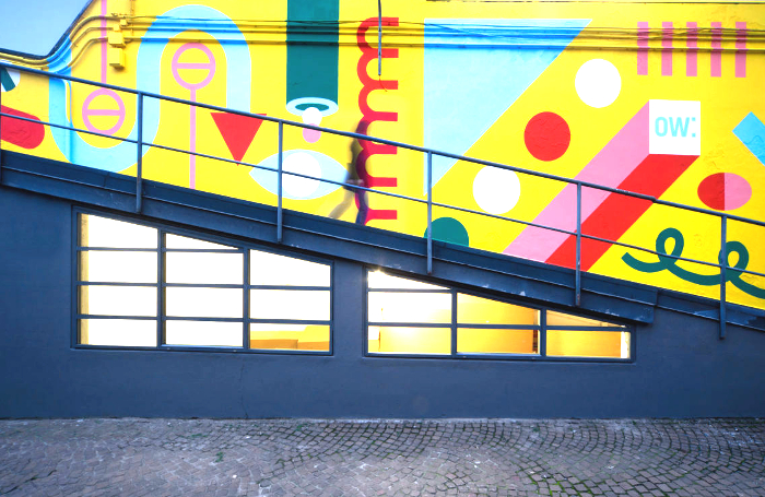
Indeed, for projects with modest budgets, employing colour and graphics is an effective mechanism to deliver low-cost, high-impact design, and can be especially effective in fit-outs.
Small interventions can make a huge difference: using wall-space for murals, signage, and graphics can generate an identity where previously there was none.

"We’ve changed our attitude to colour since working with Katie. That fear of colour is no longer there!" admits Sanjuan.
Even their ‘pure’ architectural work has been informed by the practice’s multi-disciplinary attitude. While residential or home refurbishment projects do not require a business design identity, the practice has benefited from adopting a ‘branding attitude’: it informs and clarifies how they approach a brief ,and how they communicate with a client. It has also brought about a change of pace to the office.
"We have a mix of projects at different paces," Sanjuan says. "There are longer-term projects where you’re creating graphics and branding alongside the architecture. Then there are specific graphic projects where you see the finished product quicker. It’s rewarding for the whole studio."
Thanks to Laura Sanjuan, Founding Director, and Katie Stamp, Head of Graphic Design, at SODA Studio.
Text by Neal Morris. This is a Professional Feature edited by the RIBA Practice team. Send us your feedback and ideas
RIBA Core Curriculum Topic: Business, clients and services.
As part of the flexible RIBA CPD programme, Professional Features count as microlearning. See further information on the updated RIBA CPD Core Curriculum and on fulfilling your CPD requirements as an RIBA Chartered Member.
Posted on 6 June 2019.


