Freestyle exhibition explores the richness, diversity and importance of stylistic movements in architecture. Delving into the RIBA’s world-class collection of drawings, artefacts and objects, this exhibition traces a narrative through architectural history, exploring the relationship between mass-media, technology and the evolution of style in British building.
Twenty-two objects from RIBA’s collections feature in the exhibition, which has been reimagined as a virtual reality space you can explore from home. The objects have been chosen for the architectural style they illustrate, but also for the media format through which they inspired generations of architects and tastemakers. This selection provides a snapshot of how different types of media link to the dissemination of different styles, from the influence of travel journals from the far east to magazines of popular culture that informed modernism.
Oriental Obsessions
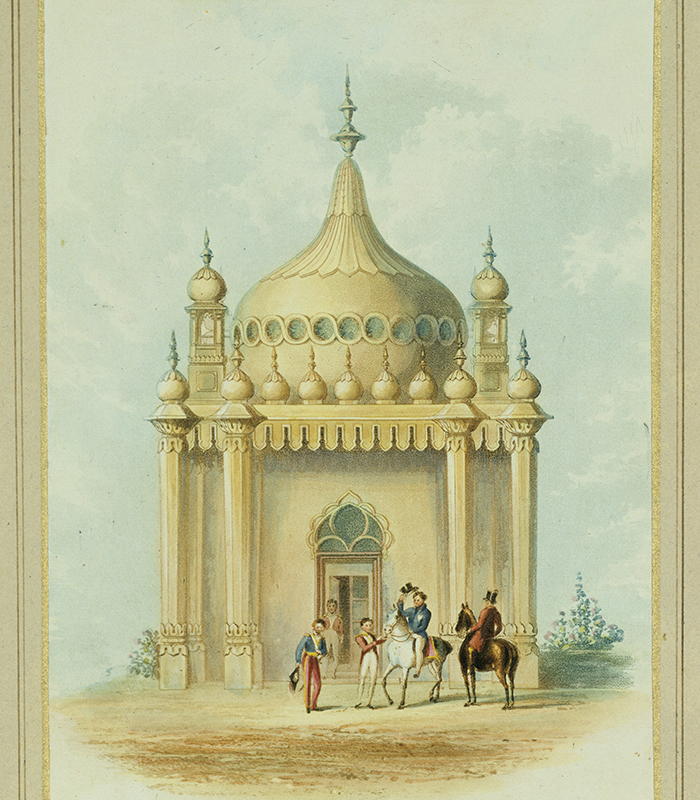
A romantic piece of architecture, the Royal Pavilion at Brighton evolved over some 30 years to suit the whimsical tastes of the Prince Regent – later known as King George IV.
The Pavilion was the result of a collaboration between the interior decoration firm of Crace and the architect Sir John Nash. During the late eighteenth century, the British Empire was expanding; increased trade with the Orient fuelled creative imagination, giving rise to Chinoiserie and other forms of exoticism. Much of Nash’s inspiration stemmed from the book 'Oriental Scenery' by Thomas and William Daniell, a father-son duo who travelled the Indian subcontinent for seven years, making their observational studies.
Back in Brighton, the original Marine Pavilion – a neoclassical building by Henry Holland – was augmented by a massive fort-like stable complex (now home to Brighton Museum) sporting embellished minarets and scalloped arches, reminiscent of Indian Mughal architecture. In 1815, spurred by the completion of the stable complex, the Prince Regent ordered Nash to replace the extant residence with the current Royal Pavilion, in all its onion-domed glory.
The Pavilion has been called fanciful, extravagant, eccentric, a piece of outrageous folly and a stylistic phantasmagoria. Though not directly influenced, it is worth noting that the Pavilion follows the same development period as Samuel Taylor Coleridge's famous poem 'Kubla Khan' (drafted 1798, published 1816), which begins, "In Xanadu did Kubla Khan/A stately pleasure-dome decree".
In the same spirit of wanderlust and eclectic oriental fascination, the walls in each room of the Pavilion contained rows of Chinese paintings and the banisters on an entrance staircase are painted to resemble bamboo, even as the exterior references remain strongly Indo-Saracenic.
Encyclopedias of Embellishment
Owen Jones was one of the nineteenth century's most influential design thinkers; from his prototypical ideas for the school that became the Royal College of Art, to the tremendous impact of his beautiful masterwork, 'The Grammar of Ornament'.
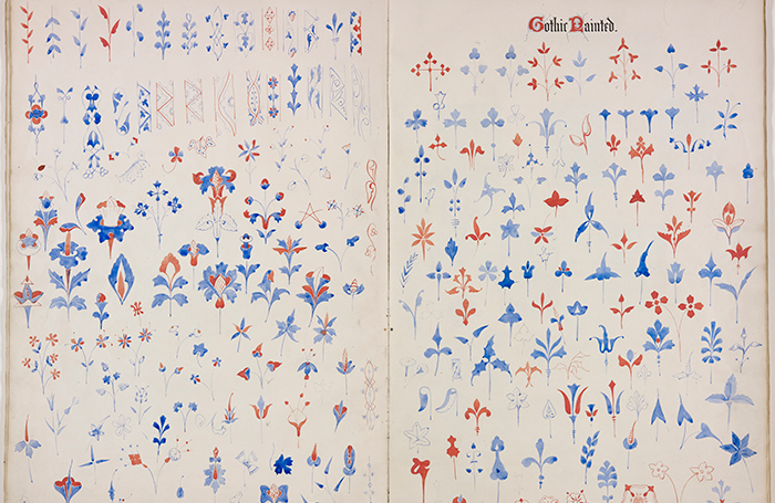
Featuring over a hundred plates 'The Grammar of Ornament' became one of the most influential ornamental reference books for architects and designers alike. In order to preserve crispness and accuracy, Jones used the expensive technique of chromolithography, with images composed of up to twenty layers, each colour prepared on a separate stone.
Freestyle features both an early edition of this exquisite imprint – of which even the cover is ornamental, in heavily embossed leather – as well as a preliminary set of watercolour sketches of Gothic ornamental flora. When Jones’ taxonomical collection was finally produced for mass printing, the book included a spectrum of historic and global styles: Persian, Hindoo, Chinese, Tribal and Celtic patterns took their place in his usefully comparative catalogue.
Jones had hoped his collection would inspire a new generation to invent their own ornament. Ironically, it gained huge popularity as a cheaply reprinted sourcebook for imitation, very often used in schools of art and design.
Going Back To Gothic (Revival)
Architect, designer and impassioned ideologue of the Gothic Revival, Augustus Pugin was critical of his own time. A latecomer to Roman Catholicism, his embrace of its ornamental and ceremonial richness was even more fervent. Pugin saw the thirteenth and fourteenth-century medieval period as the most creative and beautiful age in Western history. His ornate, Gothic-inspired designs for furniture and interiors were most famously deployed in the Palace of Westminster, making them instantly desirable.
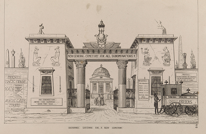
This drawing heavily represents the author's tastes, and is taken from Pugin's work, 'An Apology for the Revival of Christian Architecture' in England.
Though this non-denominational, multi-faith cemetery may seem utopian measured by today’s values, Pugin published this drawing, as part of a book he wrote while employed as a professor of ecclesiastical antiquities. The revivalist Pugin drew this in protest at the lack of restraint and composure in English church architecture. For such a religious man, this cocktail of diversely influenced styles was profane. Pugin urged his fellow professionals to shun the excesses of French and Italian styles popular at the time, instead reviving the Gothic tradition as an architecture that he felt to be both Catholic and suitably English in style.
Today, an inclusive culture of different historical and regional influences would be something to celebrate. Pugin, however, had a more severe opinion: in architecture as in religion, an impure mixture of styles was unwholesome, signifying a "decayed state of faith".
Bright Young Things: Art Deco & modernity
The interwar period brought many artists and architects from Europe to Britain, along with modernist and art deco influences from the Bauhaus and other design schools.
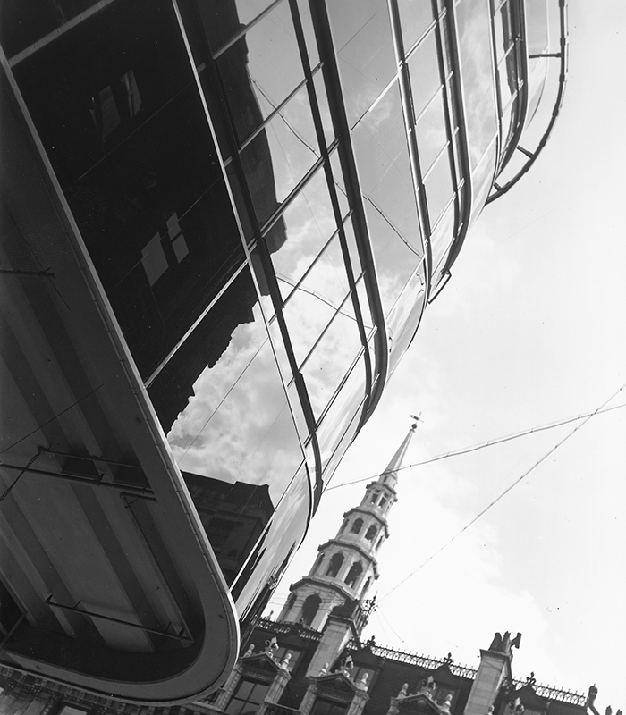
In the early days of the form, architectural photography was a difficult discipline to master. Long exposures were required to capture crisp architectural details, but urban life meant that such images would have to be dramatically cropped, excluding all figures. Dell & Wainwright, official photographers of 'The Architectural Review', leaned into these technical constraints, producing powerful, urban images which complemented increasingly modernist tendencies in building.
The dizzying angle of this photograph seems to echo the dynamic curved glass of the Daily Express building, while the ornate, historic steeple of St Bride's Church emphasises the glossy reflective surface by contrast. Designed by Ellis & Clarke and, significantly, the engineer Sir Evan Owen Williams, the building was constructed between 1930 and 1932 to house the newspaper’s printing presses and extend their offices. Contrasting starkly with the Portland stone-faced buildings in the area, its reinforced concrete frame cloaked in black Victrolite was perhaps Britain’s first example of ‘glass box’ architecture. Inside, sumptuous Art Deco interiors were created by Robert Atkinson with the striking entrance hall featuring an imposing oval staircase.
Dell and Wainwright’s abstract angle and characteristic use of strong contrast echoes radical art photography from the continent.
Metropolis and the Megastructure
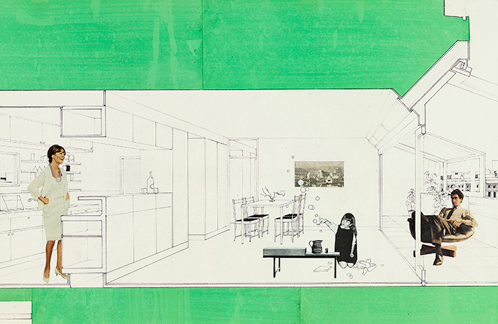
With its huge concrete frame, elevated walkways and stepped ranks of apartments with angled windows, the Brunswick Centre suggested a radically new form of urban life in London’s metropolitan centre.
Rather than proposing a high-rise tower, which form had already been refused planning permission on this site, Patrick Hodgkinson proposed an optimistic, cosmopolitan vision: a ‘megastructure’ which housed a modern London village, with family homes, a cinema, and shops. The stepped terraces were designed to open the shopping street to the sky and give each apartment maximum sunlight.
Originally, the building was planned in brick, with 16 variations in layout to ensure social diversity: ‘from ritzy penthouses to hostels for local student medics’ according to Hodgkinson. This collage illustrates the extra room provided by the glazed terraces, the technologically equipped kitchen and the large multifunctional area acting as a precursor to today’s ‘open plan’ living.
The image also reflects socio-cultural moment: all the figures are cut from magazines rather than drawn, indicating the ephemeral profusion of media images; note that the woman is dressed in formal business attire, standing in but not bound to the kitchen.
In a bid to cut costs, Camden Council scaled down the number of apartment types to just three models, while the main material was switched from brick to the cheaper fair-faced concrete. The building was somewhat neglected until a refurbishment in 2006, which then coincided with a revival in the appraisal of Brutalism. The style is enjoying a second wave of popularity through online media and its links to skate, parkour and other youth subcultures, as well as a renewed interest in the concerted twentieth-century buildings programmes of social improvement.
