Architect studios can say a lot about a practice and what matters to them. We asked practices larger and smaller, specialising in rural architecture or BIM, to tell us about the spaces they work in, their key features and how they reflect their identity and ethos.
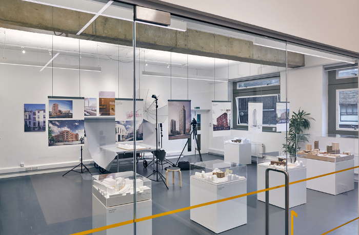
The pull of a historic creative quarter and a big open-plan space in a characterful old building is a strong one for many architects. In Birmingham, for recent start-up Intervention Architecture, the space that ticked all the boxes was an artists’ workspace on Digbeth’s Floodgate Street close by the Grand Union and Centrala galleries.
The open-plan, white-washed studio with high ceilings, original sash windows and a chimney hearth sits above a communal ‘Recent Activity’ exhibition project space. Everyone shares ideas and conversation around one large, non-hierarchical workbench.
‘We are surrounded by inspiring makers, which suits our interests in collaboration and interdisciplinary fields,’ explains founding director Anna Parker, who was shortlisted as one the RIBA’s ‘Rising Stars’. ‘We are close to the work of artists and curators who we admire and want to support in growing together locally.’
In keeping with the practice’s hands-on approach to making and designing, the studio also boasts a space for ‘making a mess, in a productive way’.
It was a derelict, listed Georgian building in central Newcastle that MawsonKerr seized upon, near Chinatown within the old city wall. The practice took over the first floor and completed renovation work themselves with the benefit of an EU grant.
‘It was a big undertaking for us at the time, but looking back now it was such an obviously beneficial move,’ says director Will Mawson.
The studio is essentially one large workspace with an Astroturf covered meeting room and a specific model-making area. Mawson says he suspects they have subconsciously recreated the environment they had at university, where ideas can flow and conversations go off on productive tangents.
‘The office is a good example of making something out of relatively little, which is a quality I really like,’ suggests Mawson. ‘We inevitably work a lot with old buildings, often listed, and this project was no different.’
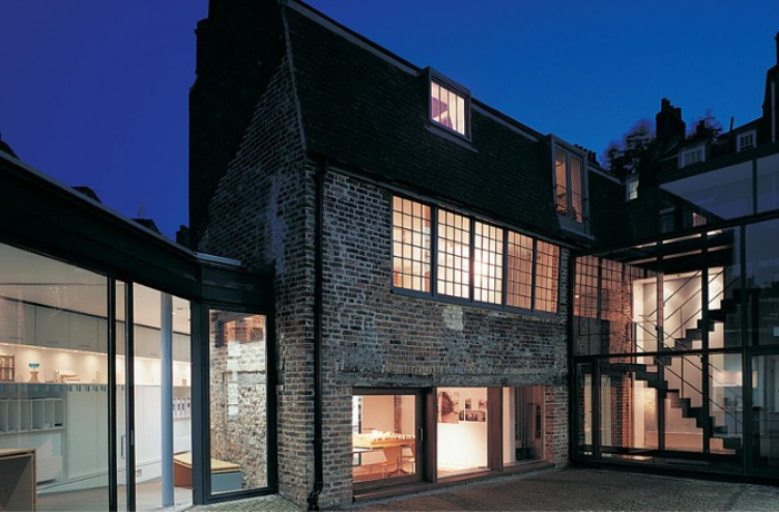
Bennetts Associates director Peter Fisher concedes that their office is ‘Tardis-like’. Its modest front door leads into ‘a much larger than expected sequence of spaces.’
Having originally looked for a conventional large open plan space in London’s Clerkenwell, the practice happened upon a group of buildings they revitalised over a ten year period: a historic barn, a redundant industrial building and a former restaurant all connected by a new-build extension.
The 18th-century barn is a rare surviving remnant from the days when livestock were rested in the area while being driven to Smithfield Market. The resulting irregular and diverse spaces, together with the range of materials and the new set against the old make it a delightful place to work, Fisher concludes.
‘Working here, as well as seeing the overwhelmingly positive reaction of visitors, has made us reflect on what a workplace should actually be like and the dangers of restrictive standards.’
The office reflects the identity of the practice at a deep level, who uses it as a case study to demonstrate the scope for reducing carbon emissions across disparate forms of construction.
For Pitman Tozer, home is two upper storeys of a converted 1960s community building on London’s Old Marylebone Road, where a 1980s fit-out was removed to give more height and rooftop views across Marylebone.
Luke Tozer says the studio is designed to be enjoyable and productive – ‘calm but inspiring’ – with an open-plan office and a meeting room on each floor. ‘There can be a bit of running up and down stairs,’ he admits.
On the other hand, having your own front door and lift marks out quite a distinction from the many hot desk strewn ‘creative hubs’, providing an authoritative feel, while clients are keener to visit and have productive meetings in the practice’s meeting rooms.
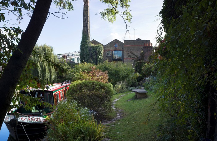
Pollard Thomas Edwards’ studio at Diespeker Wharf sits on the Regent’s Canal a few minutes’ walk from Angel, Islington and is a local landmark of sorts. The practice acquired the former Victorian timber mill from British Waterways in the 1990s. Spread over three floors, there is a modern extension for meetings and conferences.
‘It’s a demonstration of our strengths,’ says PTE’s Giovanna Puma. ‘It shows how a well-considered mix of restored historic buildings and radical new ones can stimulate social, environmental and economic regeneration.’
PTE seeks to foster a family feel, an approach inherited from the founding directors who set up the practice in an old townhouse. Their homely vibe extends beyond the office lunch – they have their own café – to social fixtures such as the staff choir and numerous sports activities.
After ten years of paying rent to an absentee architect landlord living in Antigua and phoning him on the beach when the roof leaked, Weston Williamson totted up how much rent they would have to pay over thirty years and decided to spend the £1.5m on a place of their own.
This was a five storey building the practice built on a 10m x 12m site near a Jubilee Line station in London. But after 15 years of running between five floors, the practice decided to take a more conventional turn – for architects, that is – and found a more sociable old warehouse spanning two floors.
‘Atmosphere and quality of light are important things. And great coffee too, so clients and colleagues want to come to you,’ says Chris Williamson. ‘We love our office and have tried to replicate the same atmosphere in Sydney and Melbourne.’
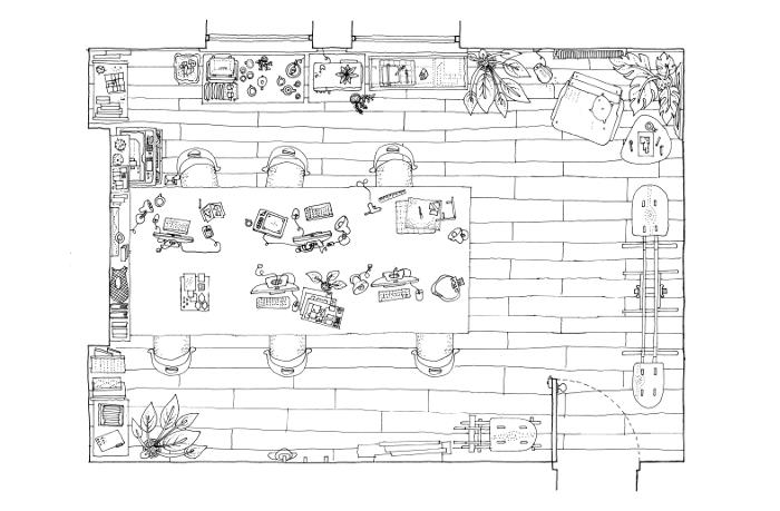
David Miller Architects was born in London’s Fitzrovia as a micro-practice and is still there today, in the office it took on ten years ago.
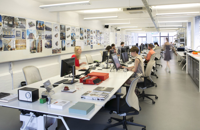
‘We were actually first attracted to this office because of its proportions,’ Miller reveals. ‘It was the perfect space to run one long desk right down the middle. The concept was to have everyone sit around it and face each other to underpin a collaborative and open working style which would lead to innovation,’ says Miller.
The office also boasts two ‘mission room’ spaces with interactive projectors around circular meeting tables to review and crit virtual prototypes of buildings with the team, or with clients and co-consultants.
‘Aesthetically, we’ve created an environment that reflects our preferred style which is simple, clean and uncluttered. It’s important that the space is comfortable and looks good, so from day one we’ve invested in high quality furniture like the Foster designed Nomos desks, Vitra chairs and Vitsoe shelving. Most crucially though we have a very robust soft grey vinyl floor – it means we can welcome dogs and have parties without worrying about red wine spills!’
Northamptonshire based Clare Nash, Director of Clare Nash Architecture, prefers a no-office structure that allows her to organise her work around caring for her son and permits her staff to work the hours that suit them.
Nash and her staff have gone about their business on an allotment, on a picnic at a pick-your-own farm, on the Eurostar, and in a German beer garden, although their weekly meetings are more typically held in a café or a pub handy for a site visit.
‘Flexible working enables everyone to be efficient in all aspects of their lives and therefore achieve a better work/life balance. I trust my staff to do the work when they choose, but still achieving deadlines. We all sign up for that and it works because we all believe in it,’ says Nash.
As a practice specialising in eco architecture, the non-existent office encourages paperless working and cuts down on commuting. And notwithstanding the rural focus of her work, Clare has found that it allows her to attract top notch staff.
Thanks to Anna Parker, Director, Intervention Architecture; Will Mawson, Director, MawsonKerr; Luke Tozer, Director, Pitman Tozer Architects; Giovanna Puma, Communications Manager, Pollard Thomas Edwards; Chris Williamson, Founding Partner, Weston Williamson + Partners; Peter Fisher, Director, Bennetts Associates; Clare Nash, Director, Clare Nash Architecture; David Miller, Director, David Miller Architects.
Text by Neal Morris. This is a Professional Feature edited by the RIBA Practice team. Send us your feedback and ideas
RIBA Core Curriculum Topic: Business, clients and services.
As part of the flexible RIBA CPD programme, Professional Features count as microlearning. See further information on the updated RIBA CPD Core Curriculum and on fulfilling your CPD requirements as an RIBA Chartered Member.
Posted on 20 December 2018.
